Bar graphs are designed for categorical variables; yet they are commonly used to present continuous data in laboratory research, animal studies, and human studies with small sample sizes (Weissberger et al. PLOS Biology).
Bar charts are ubiquitous in the life-science literature, yet a study suggests that they are often used in ways that can misrepresent research findings (Heidt, A. Nature).
Bar charts or bar graphs are common in scientific publications for depicting continuous outcomes. This is problematic, as many different data distributions can lead to the same bar chart. Depicting the data distributions may suggest different conclusions vs. summary statistics.
They are in the top ten worst graphs used in science.

Illustration & Alternatives
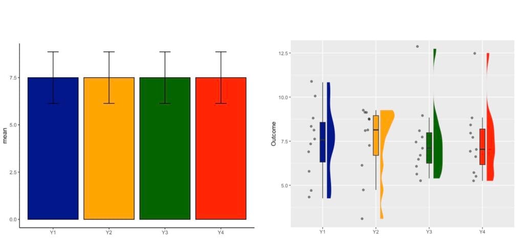
Today I illustrate this issue using the well-known Anscombe dataset which contains 4 variables that have nearly identical simple descriptive statistics (n, mean, SD), yet appear very different when plotted. The Anscombe dataset was created by the statistician Francis Anscombe in 1973 to illustrate the importance of graphing data before the statistical analysis and the effect of outliers on summary statistics.
Graphs on the Left – Dynamite Plots
- Bar Graphs
- Bar : detonator
- Error bars: firing cable
- Boom!
- So little information is depicted with bar graphs!
- This plot reports 4 averages and 4 error bars which could be standard deviations, standard errors (and rarely confidence intervals).
- This is a very inefficient use of space and some claim a waste of ink.
- What do averages mean? Averages do not usually convey much information.
- What is the spread in the data used to calculate averages?
- Are there any outliers?
- What are the sample sizes?
- These questions are left unanswered.
- Whiskers or error bars get in the way
- Perhaps they are meant to provide some information, but they are hard to read.
- They make the bars look taller, and the little information given by the bars is distorted.
- Where are the data? You learn very little about the data and their distribution.
- Where are the data?
- The data are hidden behind the bar.
- The bar also covers space where data should be depicted.
Most importantly different datasets can lead to the same bar graph!
Graphs on the Right – Raincloud Plots
As an alternative, rain cloud plots should be preferred.
- Raincloud plots for robust data visualisation
- The name “Raincloud plot” comes from the visual appearance of the plot: the cloud (density) and the individual data points (rain)!
- A raincloud plot combines multiple plots to prevent inadequate/misleading conclusions
- A density curve
- A boxplot
- Raw data (in the form of a dotplot with/without jittered points)
- Reduce clutter and enhance data visualisation
- Improve comparisons across various groups
- Efficiently capture different aspects of the data within a single plot
Show the Data, Do not Hide Them
Copyright @Statistical.Solutions
Why Are Dynamite Plots Problematic?
They Hide the Data Distribution
Many different data distributions can lead to the same bar graph. See plots I created above – raincloud plots clearly exemplify 4 different data distributions even if bar charts are similar. They fail to answer the questions below:
- Do all samples cluster closely?
- Do they form groups?
- Are there outliers?
- Generally, we assume a normal distribution of the data around the mean where there might not be one!
- In my survey of dynamite plots per journal they were more or less normally distributed.
They are Unsuited for Paired Data
Additional problems arise when bar graphs are used to show paired/nonindependent data.
They are Not Intended to Depict Summary Statistics
Summarising the data as mean and SD or SE often causes readers to wrongly infer that the data are normally distributed (without outliers). The problem is exacerbated for small sample size studies (preclinical studies).
They Hide the Sample Size
Unfortunately, way too often we have to search for the n in axis labeling, figure text, the results, or the methods section to finally find this information. There are cases where it is omitted completely. A clear understanding of sample size is critical for the review process of a paper and should be part of the standard pieces of info for reporting scientific findings.
Error Bars
There is a very heterogeneous use of error bars in publications, including on dynamite plots.
Examples of Such Plots are Extremely Prevalent in Neuroscience

Improvements: barplots with individual data points…


Conclusions
Bar graphs are designed for categorical variables, unfortunately their use is widespread to depict continuous data in laboratory research, animal studies, and human studies with small sample sizes.
Bar charts of continuous data are “visual tables” that typically show the mean and error bars: standard deviation (SD), standard error (SE) or confidence interval (CI) although for inference CI should be reported.
More training in adequate reporting/data presentation is needed by investigators and guidelines/policies should be adjusted in journals.
Some References
- Allen M, Poggiali D, Whitaker K, Marshall TR, van Langen J, Kievit RA. Raincloud plots: a multi-platform tool for robust data visualization. Wellcome Open Res. 2021 Jan 21;4:63. doi: 10.12688/wellcomeopenres.15191.2. PMID: 31069261; PMCID: PMC6480976.
- Doggett TJ, Way C. Dynamite plots in surgical research over 10 years: a meta-study using machine-learning analysis. Postgrad Med J. 2024 Mar 18;100(1182):262-266. doi: 10.1093/postmj/qgad134. PMID: 38190146.
- Drummond GB, Vowler SL. Show the data, don’t conceal them. Br J Pharmacol. 2011 May;163(2):208-10. doi: 10.1111/j.1476-5381.2011.01251.x. PMID: 21501140; PMCID: PMC3087125.
- George CH, Stanford SC, Alexander S, Cirino G, Docherty JR, Giembycz MA, Hoyer D, Insel PA, Izzo AA, Ji Y, MacEwan DJ, Sobey CG, Wonnacott S, Ahluwalia A. Updating the guidelines for data transparency in the British Journal of Pharmacology – data sharing and the use of scatter plots instead of bar charts. Br J Pharmacol. 2017 Sep;174(17):2801-2804. doi: 10.1111/bph.13925. PMID: 28801996; PMCID: PMC5554317.
- Heidt, Amanda. Bad bar charts distort data — and pervade biology. Nature 636, 512 (2024). doi: https://doi.org/10.1038/d41586-024-03996-w
- Seppälä K, Reigada I, Matilainen O, Rantamäki T, Hanski L. Anesthetic-like effects of ketamine in C. elegans. Neuroscience. 2025 Jan 9;564:79-82. doi: 10.1016/j.neuroscience.2024.11.042. Epub 2024 Nov 17. PMID: 39561954.
- Singh, Inderjit et al. The role of S-nitrosoglutathione reductase (GSNOR) in T cell-mediated immunopathology of experimental autoimmune encephalomyelitis (EAE).Neuroscience, Volume 564, 1 – 12
- Weissgerber TL, Milic NM, Winham SJ, Garovic VD (2015) Beyond Bar and Line Graphs: Time for a New Data Presentation Paradigm. PLoS Biol 13(4): e1002128. https://doi.org/10.1371/journal.pbio.1002128